Energys Dashboard Redesign
Analytics dashboard case study
Analytics dashboard case study

Energys — An energy management and analytics platform.
👉 Operations teams struggled to quickly interpret complex energy data and identify actionable insights.
👉 The existing dashboard lacked clear hierarchy and made it difficult to track key performance metrics at a glance.
👉 Create an intuitive, data-dense yet readable analytics experience
👉 Improve information hierarchy for faster decision-making
👉 Enable customizable views for different user roles and use cases
Post-redesign feedback indicated improved task completion times and higher user satisfaction with data accessibility.
Energys provides energy management solutions for businesses seeking to monitor, analyze, and optimize their energy consumption.
The analytics dashboard was identified as a critical touchpoint for users. A redesign was initiated to improve usability and data presentation.
Dense data presentation, unclear visual hierarchy, and limited customization options for different user workflows.
Lead UX Designer responsible for user research, information architecture, visual design, and prototyping.
Figma (design), Figjam, user interviews, and usability testing.

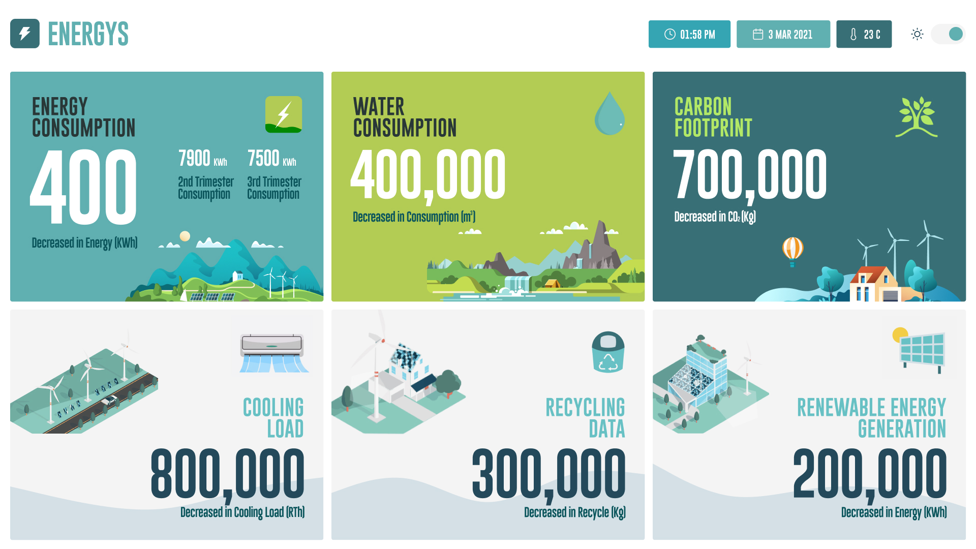
Prioritized the most critical metrics at the top of the dashboard, with supporting data organized in logical groupings.
Standardized chart types and color usage to reduce cognitive load and improve quick scanning.
Ensured the dashboard adapts effectively across desktop and tablet viewports for field and office use.
The Energys Dashboard redesign focused on clarity, hierarchy, and usability to help operations teams make faster, data-driven decisions.